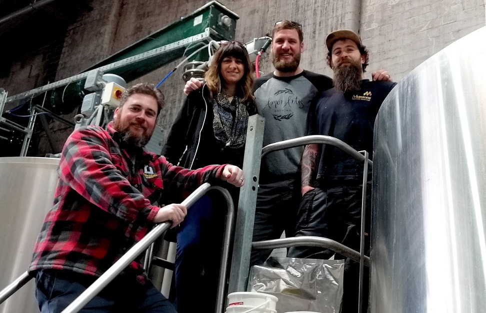
A couple of weeks ago we had the absolute honour of welcoming Travis and Khara Tolson from Amor Artis Brewing to Sheffield – all the way from Fort Mill in South Carolina. The Tolson team, which also includes Travis’ brother Steve, have a rich pedigree when it comes to brewing and a wonderful outlook on the industry which we at Abbeydale definitely share, so we were overjoyed to have the opportunity to create a beer in collaboration with them.
The brewery taproom in Fort Mill, the hometown of Travis and Steve, is designed to be a true community hub – warm and welcoming, family friendly, and the kind of place where you’re encouraged to meet your neighbour for a beer as well as talk to somebody you’ve never spoken to before. Opening in the town they grew up in meant that the community were already familiar with the Tolson brothers, so they’ve always had a loyal neighbourhood following and it’s evident that so much of what they do is inspired by their locality, something which has a really strong impact on us here too.
Husband and wife team Travis and Khara met in 2008, when Khara was in the military – the Coastguards, to be precise. Her work took them firstly to upstate New York, where Travis began to engage with the thriving homebrewing community there. When Khara was later stationed in Alaska, Travis decided to look for work relating to one of his two main passions – bikes, or beer. Upon discovering that the local cycle shop wasn’t hiring, he found work initially as a bartender at Kodiak Brewery, which was expanding at the time, and so he was steadily able to work his way up through the ranks and learn to brew.

After leaving Alaska, Travis and Khara moved closer to home and to Asheville, North Carolina, where Travis began working at a little brewpub called Wicked Weed. Within six months he had taken on the head brewer position there, and as well as brewing all of the beers sold in the pub (around one million pints per year), Travis was responsible for creating the sour base for what was to grow into a world famous sour programme.
As well as this, the time at Wicked Weed taught Travis the business of running a business, and so in 2017, along with Khara and Steve, the plan for Amor Artis was born. The family eventually got the keys to their facility in October of that year, and already had the kit and licence ready to go. Having been contract brewing since May 2017, by the time the brewpub opened on January 26th 2018, true barrel aged beer was already ready to pour, a real statement of intent for what was to come from this fantastic project. 78 different beer styles were released in the first year of trading, and already this year another 20 have followed. The Amor Artis crew has stayed the same since day 1 – as Khara puts it, “the brewery feels empty when one person is missing from the puzzle”.
Amor Artis’ output emphasises fresh, local ingredients, and has a true seasonality to it. They use only whole fruit from Springs Farm, just half a mile down the road from the brewery, which provides them with strawberries, peaches, cucumbers and melon. The Greenway, also within arms reach of the brewery, provides 2100 acres of protected land rich with ingredients suitable for foraging, where they can source the fruit for beers such as their astonishingly good Blackberry Sour (Khara’s favourite) amidst a whole range of other tasty morsels. All beers brewed with foraged ingredients raise money for the Greenway, with a dollar for each pint sold going to the organisation.
Travis declares his favourite beer to make to be a sour – as he describes it, “you get to really make a beer when you brew a sour. In an IPA, it’s the yeast and the hops which do all the hard work, but in a sour you get to really create something, for someone”.
Having visited their taproom on a trip to North and South Carolina last year and tasting those creations, we were keen to get Travis over here to collaborate, and the feeling was mutual to gain some expertise and knowledge from us around cask beer and real ale. Sharing experiences is such a huge part of beer drinking as well as beer making – Travis told us how regulars to their taproom have moved on from drinking their IPAs and pale ales to trying all their new and innovative releases, borne of a trust for the passion and craft of the product, with customer engagement and loyalty being hugely important for the team, as it is for us here at Abbeydale.
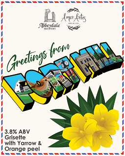
 And so, you may be wondering just what we’ve rustled up between us! Greetings from Fort Mill is a 3.8% Grisette, the first beer of such style we’ve made here at Abbeydale. The beer was brewed with wheat, oats, rice and Munich malt which provide an interesting biscuity backbone to work with. We added orange peel, yarrow and Cardinal hops, and fermented using our ever evolving house saison yeast blend. Expect a light and refreshing beer that’s just perfect in the early summer sun, with a delicate citrus oiliness, herbal honey notes from the yarrow and a spicy finish.
Available in cask, keg and can (with artwork by James Murphy) from Monday 20th May!
A huge thank you to Travis, Khara, and the whole Amor Artis team for coming all the way to our humble hometown to share their passion and knowledge with us.
Cheers!
