Meet the Artist: Lewy

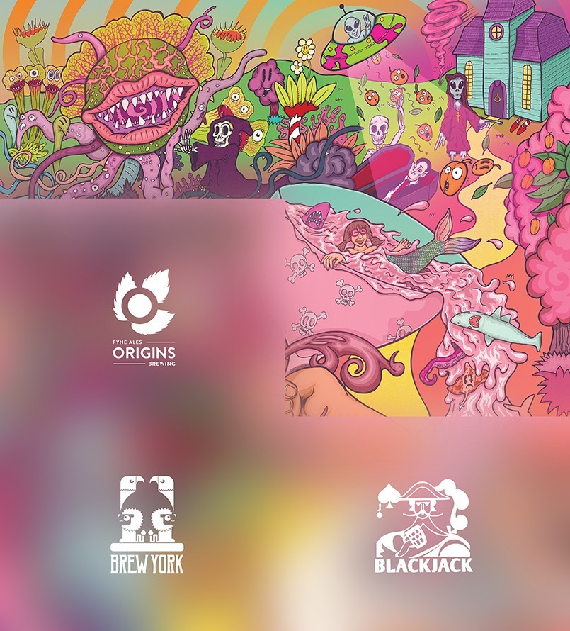
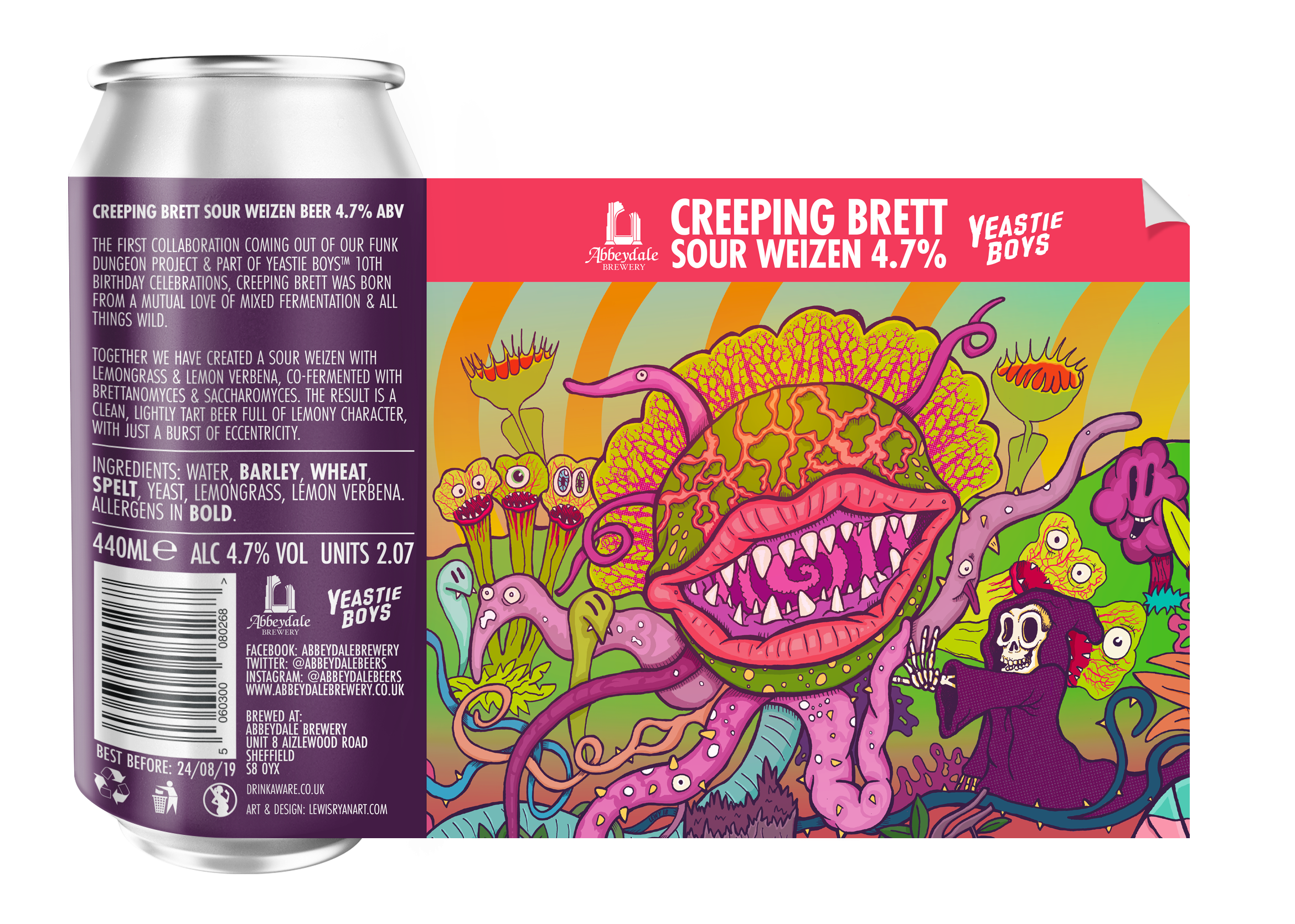
Chances are that by now you’ve spotted our most colourful cans yet… an ambitious project which takes six individual labels and turns them into one enormous interconnecting illustration, a beery jigsaw if you will! The man behind these incredible creations is Lewy (Lewis Ryan), a local chap whose epic and eclectic style first caught our eye at 2017’s Tramlines festival. At the launch of Cold Conscience, our collaboration with Brewdog and Alvarez Kings, Lewy created live art right in front of our eyes, and we were blown away. We’ve been lucky enough to get him on board the good ship Team Abbeydale to bring our latest hairbrained scheme to life, and with the project half way towards being fully released, we thought it was high time for you to get to know Lewy a little better. Read on to find out more…
Hi Lewy! Tell us a little bit about yourself – what’s your background and how did you first get into doing what you do?
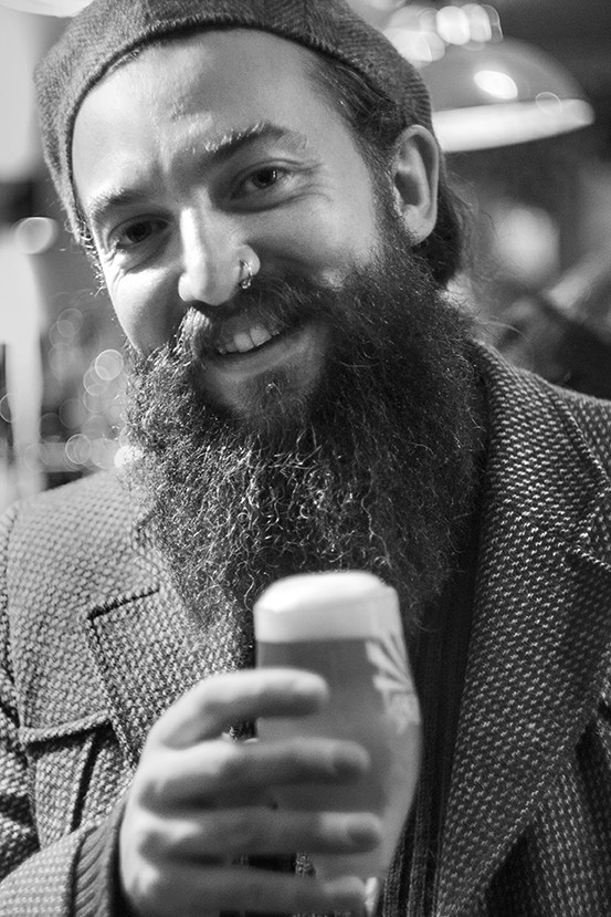 My name’s Lewy, I’m a Barnsley based creative. I collect plants (mainly cacti and carnivorous plants) and old film cameras. I love HB Stadtler Noris school pencils and big bottles of indian ink. I have a lot of pets – 7 snakes, 2 Whites tree frogs called Helvetica and Garamond and a Border Terrier called Ted. I like camping and hiking and have recently got into axe and knife throwing. I work from home in my art studio – which is really just a room I’ve renovated with reclaimed pallets to look like a shed (note from Laura @ Abbeydale Brewery – Lewy kindly shared some photos of his studio, scroll down to the bottom to see!). I grow my own fruit and vegetables in the garden most of which end up in either some kind of homebrew beer or cooked on the bbq.
I’ve always been artistic… I’ve always needed a creative outlet throughout my life, be that illustrating, painting, sculpture, photography, music, building things or even knitting. I’m a keen musician and the singer and guitarist in an Alternative folk band called The Rolling Down Hills.
Initially my goal in life was to become an artist, but somehow after studying Fine Art at University I finished and ended up in a career in graphic design. When I was studying at College and Uni’ in the late 90s the internet had just really started to be as rich as it is nowadays. I grew up coding bits and pieces, making rubbish art websites and animated gifs as a hobby – my skills kind of grew along with the net. When I finished Uni my pastime in design became my career. My art (back then mainly oil painting) took the back seat and became the hobby. Over the years I’ve worked for various web developers and graphic design businesses. I worked up from Junior designer up to Art Director.
Then somehow along the way my career took a path into Marketing; I worked at an LED lighting company for 6 years as Design and Marketing Director. The owner of the company I worked at decided to step out of the business and become CEO. He only planned to be coming in every so often, so he asked me to step up as Managing Director. Being very career minded I jumped at the opportunity. I was part way through training when he decided to sell up instead – the new business owner taking the MD position I’d been training for. I handed my notice in the next day without much thought of which direction I’d take. I was so angry that I had put so many years into building that company up. I had never felt anger like that before, so I knew I had to get out and get back to my creative roots.
I started setting up on my own the day after that. For the first year I set up an online knitting company, which still ticks over in the background today, and I did the odd photography shoot to keep the bills paid.
A lot of people know how stressful it is to work in an office, running a team and keeping a business profitable. I was like that when I worked in marketing. A lot of the creative things I used to do when I worked in design were handed to my team to develop. I ended up doing more paperwork than anything else, so by the time I got home I was too drained to feel creative. A lot of the creative energy was kind of knocked out of me. After leaving the lighting company it took me about a year to pick up my art again. When I did it was with the aim to work with people in the industries I loved – Music and Beer. I did a few illustrations to build a bit of a portfolio and hit out trying to get into those markets.
I realised shortly into that first year that my background was quite unique and it could be used to the advantage of breweries and musicians trying to get themselves noticed. As well as the illustration, I could do graphic design, print/packaging design, photography, marketing and even video editing to get new beers/albums in front of people. Having a diverse skills range has helped my career a lot.
How would you describe your own style?
Colourful, Gloopy, Detailed – I like to think people can get lost in my illustration- at least for a little while.
I like to think of it as art that could be hung in a gallery rather than just graphic design or illustration, but maybe that’s my inner fine artist speaking.
I feel my style is still developing with each project I work on. I’m consciously playing around with colour palettes in my current work, trying to use as much colour as I can in some pieces. I experiment by placing colours next to each other from opposite ends of the colour wheel, to get as much impact as possible. I’ve grown to like pink a lot recently.
When I was a child in Nursery my teachers took my Mum to one side and asked if I was alright. They were concerned that I only ever used black crayons. All the colours of the rainbow I could choose from and every time I drew, I only ever used black. I’d draw an outline in black, and then colour it in with black also. When my Mum reminded me of this recently I set about to see how much colour I can actually use in a piece. It’s a personal challenge.
As far as I know, this “beery jigsaw” is the first project of its kind. How did you go about making each piece work individually as well as being part of a whole, and do you have a favourite “segment” within it?
 The way I approached this piece was a little strange compared to the way I usually work, not just because of the jigsaw aspect, but mainly because I envisaged the whole thing pretty quickly as a whole piece. I had a tick list of all things supernatural in mind that I wanted to add. A lot of it was very clear in my mind to begin with.
It’s been an extremely exciting project to work on, because at the very start I didn’t know what kind of beers were to be brewed. Ideas were roughly pencilled in, then added to and clarified if needed when I found out a little more about the beers themselves.
I tried to zone each of the areas by using variations of colour palettes and I was careful to give a sense of scale by playing about with perspective a little.
The thing I tried hardest to do was to have just a little glimpse of the joining segment/label on each piece by letting some of the art creep into the corners or edges from the next beer in the series. It’s a fine line to do so without giving too much away, whilst building the excitement and keeping people guessing what’s coming next.
Usually I like to add directional paths or elements that the eye will naturally catch or follow to keep the viewer looking at the piece for as long as I can. With this piece I found that to be much harder to do, I really had to think about how I could do it for the overall piece, but then how it would work when the labels stood individually. I also wanted areas with loads going on, and then sparser areas that celebrated the colours a little more, the challenge was getting the right balance so the overall piece was still composed nicely. I think I’ve hit that sweet spot quite well.
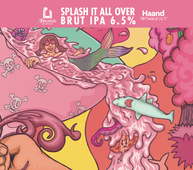 My favourite segment is “Splash It All Over” – mainly because it changes the scale of everything else and gives the biggest hint to what’s going to come in the last panel. When it was launched I think it did this quite subtly, people realise there’s a hand in there, but your eye is really drawn to the mermaid, I think the hand that holds the glass gets pushed out of your mind. I was listening to a lot of Nick Cave and The Bad Seeds when doing the initial sketches; I think the song “Mermaids” influenced this panel. I realised afterwards that the mermaid is a friend of mine and I inadvertently added her. I let her see the artwork shortly after I finished inking to make sure she was alright with it all…for weeks she was asking “When’s my beer coming out? – I want to show my Mum and Dad!”
Which other artists (whether within or outside the beer community) do you most admire?
I like the bold and graphic cutouts and collages of Gilbert & George. Style wise their work is as far away from what I do as you could possibly can get, but there’s something about the bold grids and bright colours that I have always found quite pleasing.
Audrey Kawasaki is probably my favourite fine artist. I’ve been following her work since my 20’s when I was in graphic design. Her work is mainly oils, painted onto wood so wood grain shows through, it has a very dream like quality to it. (https://www.audkawa.com/)
At the moment I’m really loving Polly Nor’s illustration work, it’s very stylistic and often quite dark, I’ve always been drawn to art that’s a little sinister in some way. Her art is filled with devils, demons and strange slug-like worm creatures. I highly recommend taking a look.
Simon Davis is also a big inspiration for me – He’s created some amazing artwork for comics and graphic novels over the years, my favourite being the artwork he created for “Slaine: The Brutania Chronicles”. He has a very painterly style when compared to other comic book artists, preferring to work with gouache over his ink work, rather than colouring digitally like most modern comic artists. I think it’s that more fine art approach to comic book illustration that I like about what he creates.
There are a few artists in the beer scene I admire: James Yeo over at Left Handed Giant is so prolific, and his style is just up my street. He has a way of using colour and line work that makes his art seem simple and yet complicated all at once.
Although more an all round illustrator McBess has done a few beer labels – One for US Brewery Oskar Blues, and their Dale’s Pale Ale Cans – His illustration work is lovely stuff, with a very pen and ink style – I like that he prefers not to use colour at all, it gives his work a real traditional hand drawn on paper feel , even in instances where he has drawn digitally.
Finally… what’s your favourite beer style?
Can I have two? Imperial stout – The thicker, gloopier (is that even a word) and richer the better for me when it comes to an imperial stout. Also Flanders Red – there’s something about the sourness and that vinous edge that I love in a good Flanders Red. Out of the two styles I find it very hard to choose one or the other, it all depends how I feel that day, however if I ever see Duchesse de Bourgogne or Rodenbach on tap in a pub it’s got to be that.

Huge thanks to Lewy for taking the time out to chat to us and share an insight into his artistic mind! The remaining three beers of the series are due to be released over the next 6 weeks, so keep a look out for those and keep that jigsaw growing!
Cheers
